For decades, a curling, arc-serifed typeface emblazoned the uniforms of our beloved University of Kansas basketball players as they earned conference championships, final four appearances, and even a national championship. From Danny Manning and Paul Pierce to Drew Gooden and Kirk Hinrich, this KU typeface has subtly evolved into a unique symbol of Jayhawk pride.

As representative of basketball dominance as the Rock Chalk Chant and Allen Fieldhouse, these embellished characters distinguish the Jayhawks from the block-lettered herd.

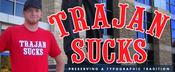
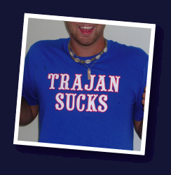
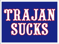
Sadly, those days are over. Eschewing this rich tradition in favor of an ill-conceived (and expensive) attempt to standardize the KU brand, university officials have replaced these famed letterforms with a typeface that only a corporate consultant could love. The new typeface—Trajan—cuts a lackluster profile unfit for the country’s premier program.

We disenfranchised students, alumni, and fans need not acquiesce to this blunder. Make no mistake, we will support our team with zeal, but we need not accept the administration’s sartorial tastes. Buy a shirt, post a comment, and let it be known that TRAJAN SUCKS.


Show your support for typographic traditions, and the Jayhawks. Shirts are only $10 plus shipping.

All shirts sourced from American Apparel. Additional sizes available upon request—just contact us.

Select your color & size to purchase, pay with credit cards or PayPal.


Show your support; buy a shirt. $10 + shipping.

Select your size to purchase!
Red: S | M | L | XL

Select your size to purchase!
Blue: S | M | L | XL


The people have spoken:

  • "Manning, Pierce, Gooden, Hinrich...WHAT ABOUT ME??? Did you forget about the double-naught spy? Seriously, leave the hoops jerseys alone. The circus font is the Kansas basketball calling card. As far as the football helmets I'd prefer a ripoff of the Seattle Seahawks logo modified for team colors. "
    -- Greg Ostertag
  • "You guys, someone needs to start an online petition. It would have to include real names, addresses, phone numbers, etc so people whould know it's legit. It should be simple: RESTORE THE CIRCUS FONT TO KU MEN'S BASKETBALL. Let them keep their Trajan for all the other sports ans logos and letterheads and whatnot. JUST LEAVE THE CIRCUS IN THE BASKETBALL. It's the only way Bob and Lew and Jim are gonna listen."
    -- Brandon
  • "Please put your money where your mouth is, not only by buying the Trajan Sucks shirts, but also and more importantly (sorry website owners, but it's true) DON'T BUY any of the new support gear in trajan font. Obviously, the athletic department cares very little for tradition (even if it's only a few decades old), but they will care if sales plummet. That, I assure you, is the only thing that will bring back the old font. I'm sad that, even if we get the old font back, we'll have to look back at this year's nasty trajan. Watch this be the year we win the championship in that ugly, ugly font..."
    -- KU
  • "Get Over it...That font's tradition is nowhere close to the Rock Chalk Chant. You are the same type of people that complained when they put the video board in AFH (whaaa it takes away from tradition.)."
    -- Rock Chalk
  • "As a KU graduate with a BFA in design and 10 years real world experience I have to say, yes, TAJAN SUCKS. What left brained loser thought this up? Yes, it was most likely some marketing hack that has briefly played around in in-design and thinks they’re some pro. Hey Hack! Try figuring out how to do your own job not a designers job. If a designer dreamed this up all I can say is you're the worst designer of all time and you suck as bad as your Trajan font."
    -- Philip A. LaMonica
  • "Kansas should go to a uniform typeface, but it should be the circus font adorning all KU sports uniforms."
    -- Tim P.
  • "KU football is 5-0 in trajan font unis. Keep them FOREVER!!!"
    -- Dustin T.
  • "Check out this movie short at Veer.com -- it's a great animation about how the Trajan typeface is so over overused on movie posters."
    -- Andy V.
  • "Thanks for adding small shirts to the catalog--I can't wait to show my support."
    -- Rob T
  • "Kansas Basketball has been using the circus-style font since at least 1986, maybe even earlier. That means something to me, and it looks like there are lots of others who agree. Now I have nothing wrong with the university wanting to consolidate their image and logos. I had accepted the trajan logo. When they put it in the Jayhawk, I decided it wasn't a huge deal because the bird itself remained the same, and the origianl KU block letters was nothing special. When they integrated it into the football uniforms, I also didn't care, mainly because the football team has changed their design so many times it doesn't matter. There is NOTHING wrong with preserving the circus-style fonts. In the university just HAD to have the trajan somewhere, can't they just slap the 'KU' logo on the left side of the shorts (the Jayhawk would still be on the right side). Or just put a little 'KU' at the top of the jersey like they have done before. Then we preserve our beloved design, and the university can have it's precious investment shown."
    -- Brandon S.
  • "please change it back, trajan looks really bad "
    -- matt.copeland@geneva.edu
  • "Re: "typographic tradition" True, the "Kansas" font (the "Pointedly Mad" font name people are throwing around has isn't quite right. I don't know the name of the true font) has only been around since the early 1980's. However, in that short span of 25 years, KU has taken that font to several successes, including a national championship. The past 25 years have also seen both the advent of cable tv and the internet and the proliferation of sports media coverage. Because of this, KU has established a "brand" with this font. So much of a brand, that most people think that we've been using this font forever and is synonymous with Kansas basketball. (UNC argyle hasn't been around forever, either.) Just search for videos and images of KU basketball on the internet. Pull out those old VHS tapes of games from 20 years ago. The font is there. It's everywhere KU basketball is. Not only is the University doing a disservice to its fans, it's also throwing away 25 years of successful sports marketing of a recognizable font, only to change it to something relatively bland and conservative."
    -- Patrick
  • "Typographic Tradition? The font has only been around since the early 80's. You must consider KSU to have a football "Tradition""
    -- Bill
  • "Trajan Rocks, YOU suck! "
    -- Mike
  • "This is what happens when you let people who don't actually understand branding or visual identity take a couple meetings with their overpriced design agency and then start "deciding." Trajan sucks real bad on basketball jerseys."
    -- ck
  • "in the typographic sense, you are wrong to say that Trajan sucks. you might not like it, appreciate, whatever, but the typeface itself serves a great deal of purposes. i, although not a Trajan lover, find it to be a better choice over the original. legibility is key when talking about type. and KU basketball is over rated. "
    -- jimmy crack corn
  • "I can't believe how terrible the new Trajan typeface is! Fight on, people. We can still save basketball season!"
    -- Roger
  • "I think you set up this whole website just to make money. Trajan rules!"
    -- Susan
  • "The trajan does suck"
    -- DAN
  • "The new font is terrible. I agree with all below who say they won't buy gear with the new font. The t-shirts look like something you'd put together yourself with printed-out iron-on trajan letters. It's like we paid somebody to find the most boring font in MS Word. My guess is it was a tough call between trajan, times new roman, and courier new. "
    -- '03 Grad
  • "The Trajan font just wont have the same mean Kansas Basketball look we have had for our winning teams!"
    -- Wes Elliott
  • "Absolutely awful and embarrassing. Atrocious and sickening. What will they think of to screw up next? The last two years the football uni's have been the best look we've had in a long long time. We're going to the worst we've EVER had, in my opinion. And as terrible as this look is for football, it will be even worse for basketball. I for one, will NEVER purchase any KU merchandise with the new trajan font. And I regularly purchase several items a year. How many more people feel the same way? The two football players I've spoken to about this can't stand the new look. Whats next? Black band uniforms? Woops- already done that... "
    -- LL
  • "Trajan is a font well-suited for karate class banners and personal stationary, but I must agree...I don't care for it on KU merch. "
    -- '04 Grad
  • "As a graphic designer, a graduate from KU's design program, and an unabashed KU basketball fan, I can say with some authority that Trajan Sucks! Living in Omaha, I was dismayed when I went to a local store to purchase a new KU cap, and found that all that was available were hats with the KU letters in Trajan. I assumed that they were knockoffs since the typeface looked not only generic but wimpy! Trajan may be an elegant and classy typeface, but it is horribly ill-suited for sports apparel. Put some character back in our characters! Bring back the curly serifs! "
    -- Christian Thom
  • "I don't think anybody really cares about the football uniforms. The fact the university is so nonchalant about frivolously spending our money on these changes is the worst part. How are we supposed to maintain an image if we change it every few years?"
    -- Matt Walker
  • "I can't believe they're trying to change the font. Leave it alone for basketball. It is not a disposable branding element. I don't care if we've only used it since the 80s; the new font is ugly. I won't buy gear with the new font on it. "
    -- Kara
  • "Well, yeah, guys, the curly-serif face is cool, but it's not that old. I remember them switching to it when I was a graphic design student there in the 80's. Can you find out if there was an historical precedent for that switch? As for Trajan, we just got rid of it here at Okla. State U. after 10 years. So I was sad to see that my alma mater was just taking it up ... Rock Chalk!"
    -- Valerie Cummins Kisling
  • "It is a font, no matter how the writing looks it reads "Kansas" isn't that the important part?"
    -- Dustin T
  • "Its sad that supposed KU fans will go through this much trouble to bash their school. Haven't we had enough change in football unis the last 8 years? I like the trajan font and I hope these football unis stick around for the next 30 years or so."
    -- Hawk Fanatic
  • "This change is the wrong way. The university needs to ditch Trajan in favor of the typeface on the basketball uniforms, and all other programs should comply that way!"
    -- Ron Crummett
  • "From an alumni point of view, I always liked that, at KU, more value was placed on concepts like tradition and less on corporate marketing schemes that "throw out everything just for the sake of change ." With this latest one, they make our already recognizeable and winning "brand"...disposable. Was this intended? Unfortunately, this new uni look is really "precious" and they'll now look more like "costumes" my 3 year old granddaughter would wear (and a lot less like classic, tradition-laden uniforms.) Maybe we should just change our name to "TeleTubbies".. ..at least my granddaughter would be happy. Rock Chalk, dammit! "
    -- Big Ron W.
  • "I feel like a part of me died a little bit when I found out the uniforms were changing. As a recent transplant into Longhorn territory, I've been talking trash non-stop. Thanks to this hideousness, there is now one (and only one) thing Texas has over us- and it's no longer Kevin Durant. "
    -- rock chalk!
  • "Why would you fix something that isn't broken? Another example of changing a design just because you can. BAD. The bureaucracy at KU just doesn't Get It. (TM) http://www.uniwatchblog.com"
    -- PMURS
  • "Go Cuz! "
    -- The Todd
  • "As a Kentucky fan, the only thing I ever liked about Kansas was their uniform fonts. Bring it back and dump the Trajan."
    -- Bob
  • "I hate trajan... I hate it... I hate it..."
    -- graham
  • "Stop the Insanity! Don't let this movie-poster font be put on a classic basketball jersey! By the way, does the "circus font" have a real name? Like "Phog Serif" or "Rock Chalk Roman"? And, do you know where I can get this font?"
    -- ChrisM70
  • "Trajan was the emperor of Rome when it reached its territorial apex. He's dead. Terefore, it is mathematically proven: TRAJAN SUCKS."
    -- Sam
  • "Im a diehard KU fan, and spend a good part of my life growing up in KS, and i think the change is a terrible mistake. Kansas basketball wont be the same without the classic font."
    -- Dan
  • "I'm not even a Kansas fan (Clemson), but I'm thinking about buying a shirt. It didn't get much more distinctive and classy-looking than the Kansas serif font."
    -- Brad
  • "I've never been a Kansas fan, but I can honestly say, that I've always loved their basketball uniforms and the typeface that screamed KANSAS...Trajan must go!"
    -- RyanKMD
  • "Come on! We are a school based in rich tradition. If we wanted to be cliche, overused and boring... we wouls have gone to Mizzou!!"
    -- Cameron
  • "What would Max think?"
    -- MIke
  • "Although Trajan is a well constructed font, it is also incredibly cliche and overused. Best of luck on your campaign of preserving typographic tradition."
    -- Neal Peterson
  • "Wow, I didn't think a font could make or break something, but man, Trajan is horrible! "
    -- Shelby
  • "Whatever happened to good old websites like "TrebuchetMSsucks.com?""
    -- MasterGrr
  • "I've put up with a lot over the years--the classic center court turning into a giant Jayhawk, the addition of a Trajan KU to the Jayhawk, complete with an absurdly large descender on the K. Trajan on the basketball jerseys is a sin. Do what you want with football, but let basketball be."
    -- Rob T
  • "Trajan KU = New Coke"
    -- DW
  • "Hey, Hey, Ho, Ho, Trajan font has got to go! The new font is crap, and anyone who can't see that is blind or willfully ignorant. I don't want Kansas beating Arizona, but I will fight to the death (or at least post anonymously on the internet) for your right to a clearly superior font on your jerseys."
    -- MoMo
  • "Here's to keeping resume fonts off our jerseys! Rock Chalk!"
    -- Tad S
  • "Awesome!!!! As a graphic designer and fan of college sports, not to mention a traditionalist.... Geaux Tigers (LSU, that is!) .... I love this. The tradition that is Kansas Basketabll is truely represented in this font. Goof for you!"
    -- Geaux James
  • "I couldn't agree more. The new font looks ridiculous. To add insult to injury, I still can't believe that the university paid $80k to research it and make the change."
    -- Mark
  • "Great site! Beating the Hawks in Chicago last year wouldn't have been such a great upset if Trajan had addorned the front of the KU jersey!"
    -- Matt Blue Demon
  • "It doesn't matter if the circus font doesn't got back more than 25 years, the fact of the matter is that is is uniquely identified with Kansas basketball and our fans love it. Changing this is a travesty on a par with 70's era MLB jerseys and it won't be long before KU changes it back. SCREW TRAJAN."
    -- Greg
  • "I hate to burst your bubble, but the font is not that historical. We started wearing it in the 80's. That's not exactly steeped in tradition. It's not like they're changing the colors, or the mascot."
    -- Eric
  • "The circus font was tired. They should go straight block lettering. Bring back the real tradition!"
    -- scott
  • "Thank you, thank you, thank you. I feel as if the University has taken a cheese-grater to my childhood by removing this unique font from the basketball team's uniforms. I feel like the new identity was created in Microsoft Word. Death to Trajan."
    -- Austin Gray